The mobility business is undergoing a major transformation. D’Ieteren has more than two centuries of experience in finding solutions to improve our mobility. The company wants to contribute to a fluid and sustainable mobility for all. A mobility that is adapted to our reality and no longer dominated by traditional cars.
Our solution
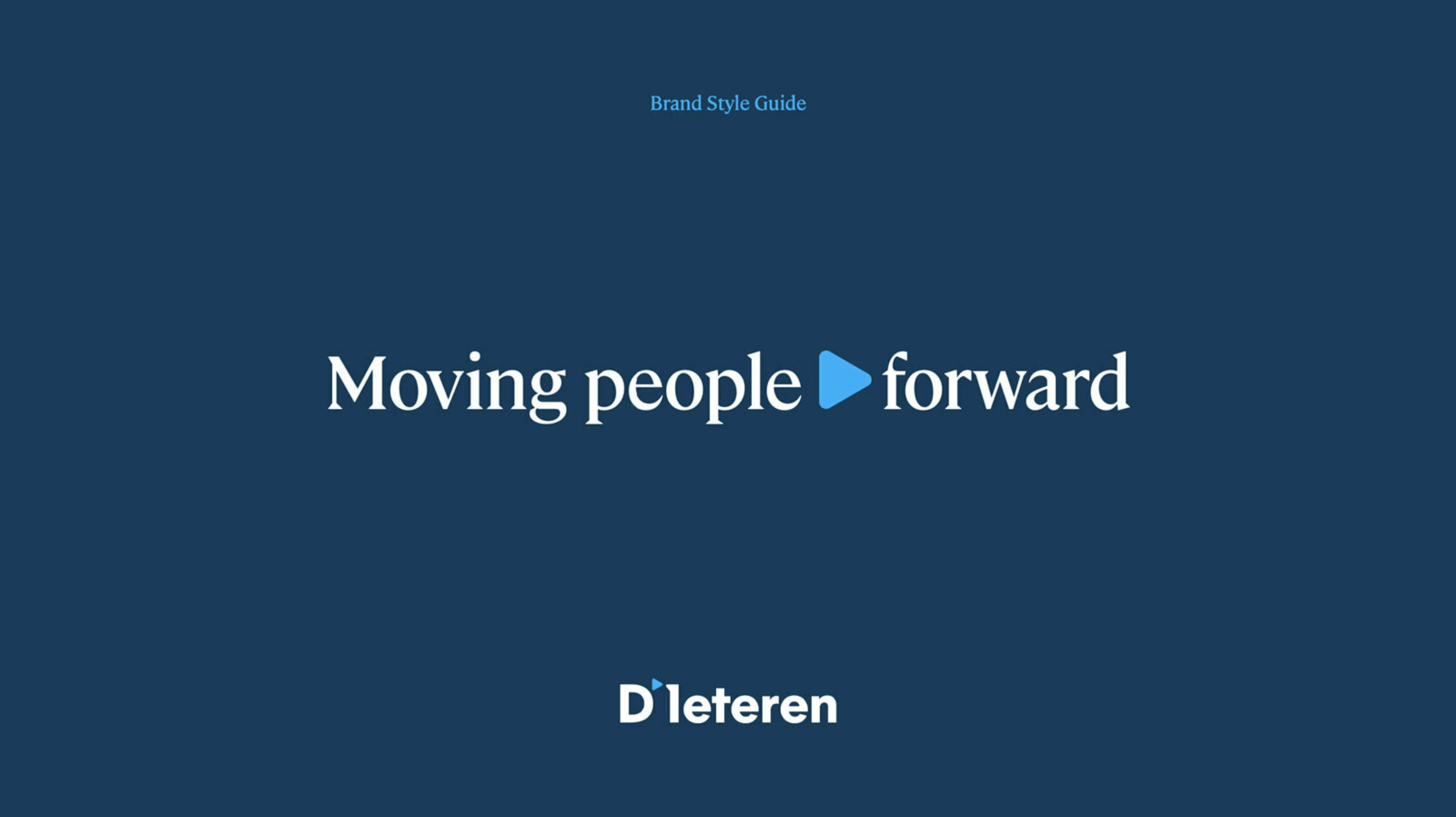
In the company’s new vision, the brand has the ambition to become the natural choice for mobility in Belgium by 2025, whatever the mode of transport used. With that in mind, Think BBDO worked with management to come up with a purpose statement.
Moving people forward is what drives change and innovation at D’Ieteren. This was the case in the past and it will continue to be so in the future. The company wants to continually reinvent itself to keep on meeting our society’s ever-changing mobility needs.
The purpose was then encapsulated in a new logo. The name D’Ieteren was retained, but with a new typography to accentuate the name and make it more readable. The old carriage made way for the dynamic ‘forward’ symbol: moving forward in every sense of the word.
The symbol is the most important element in a completely new house style. One that reflects the company’s vitality while showing respect for the grandeur of this 200-year-old family brand.
- Branding