The Port of Antwerp is one of Europe’s largest ports and a world-class port. Following the appointment of a new CEO and given the changing world in which it was operating, the port was in the throes of a transition. The key question was how this public company could optimally incorporate this transition in its branding.
Our solution
To measure is to know, which is why we kicked off this process, in 2017, with a far-reaching qualitative stakeholder survey. Our objective was to map the port’s current context and images, based on in-depth discussions with major stakeholders (policy-makers, CEOs etc.)
We used the insights from this qualitative survey to develop a new mission and vision for the Port of Antwerp in a participatory process, with the port’s board and executive committee. After a positioning exercise, we drafted the mission and vision, as well as a new baseline.
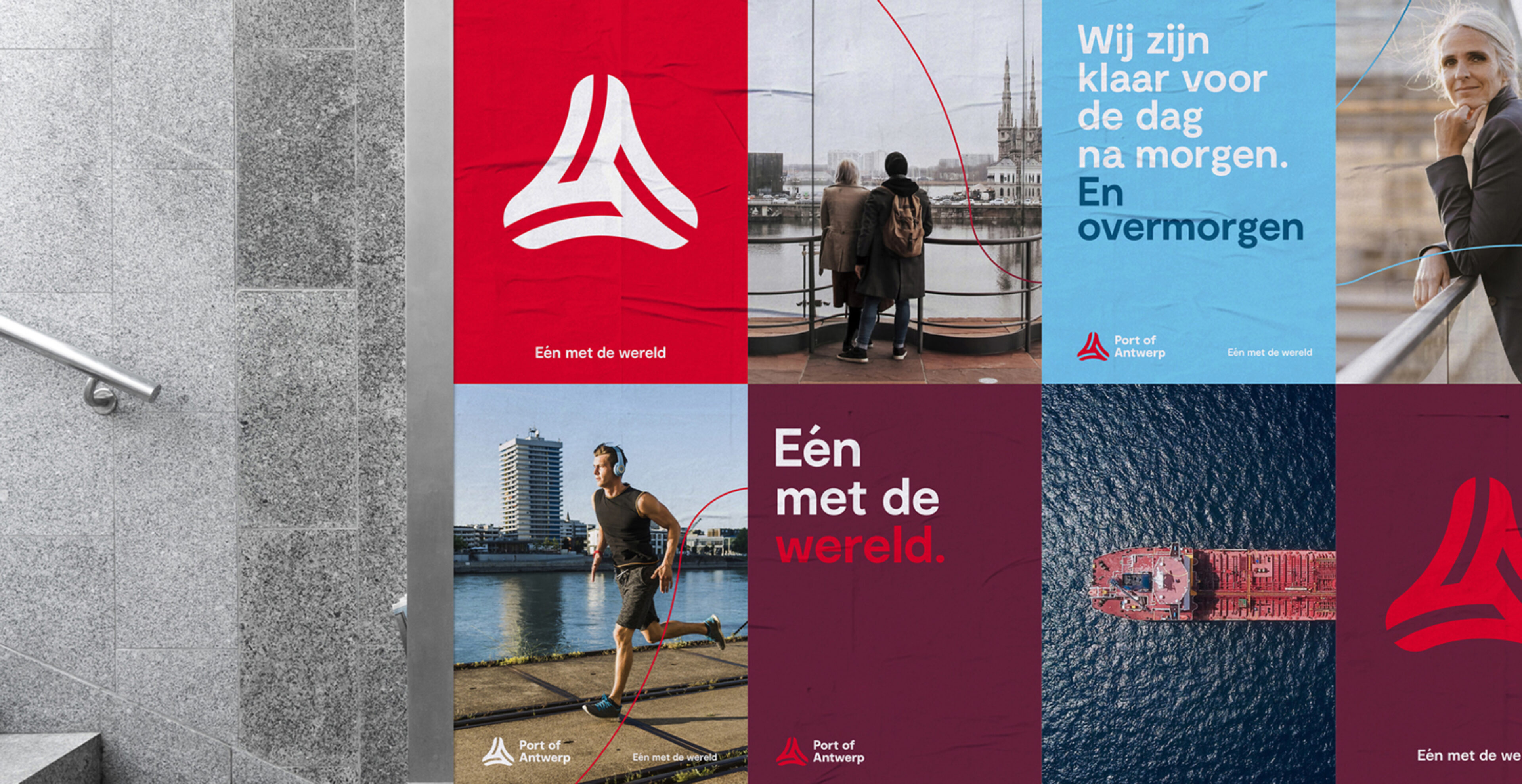
Port of Antwerp is ‘In tune with the world’. With this new positioning, Port of Antwerp wanted to highlight its position as a world-class port, emphasising the unique recipe that was developed in Antwerp’s port community: collaboration, building bridges and connecting people.
The brand was first launched in-house among the port’s workforce of 1,600 employees. The employees were the faces used to illustrate the stories about the port that were told in the campaign. They showed how they already were “in tune” with their colleagues, customers, or society as a whole.
At the same time, the port organised interactive training sessions to acquaint employees with the port authority’s new mission and vision. Think BBDO applies an internal branding methodology, based on a “train the trainer” concept and a toolkit for the workshops.
At the end of 2018, we developed a new, powerful visual identity for the port authority. The Port of Antwerp is a beacon of trust as well as a brand that keeps an innovative and open mind about the future. We developed this idea, launching a redesigned logo, choosing to focus on evolution, rather than revolution. The round shape symbolises accessibility, collaboration, and dynamism. The bright red exudes rejuvenation, power, and vitality. The style and tone of voice were also overhauled to match the Port of Antwerp’s new mission and vision.
- Branding, Change communication, Corporate communication